
We often forget, but the simple table is a visualization too. In fact, all of our visualizations are based on the DataTable structure - a table itself.
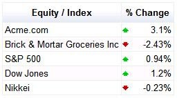
In order to make this most basic visualization more appealing and useful, we added formatters to our JS table. Take a look at this arrow-format example, great for visualizing stock quotes or anything else that goes up and down. :-)
For example, to produce this result:
Use this code:
<script type='text/javascript' src='http://www.google.com/jsapi'></script>
<script type='text/javascript'>
google.load('visualization', '1.0', {'packages': ['table']});
google.setOnLoadCallback(draw);
function draw() {
// Create a datatable with your data.
var dataTable = new google.visualization.DataTable();
dataTable.addColumn('string', 'Equity / Index');
dataTable.addColumn('number', '% Change');
dataTable.addRows(5);
var r = 0;
dataTable.setCell(r, 0, 'Acme.com');
dataTable.setCell(r, 1, 3.1, '3.1%');
r++;
dataTable.setCell(r, 0, 'Brick & Mortar Groceries Inc');
dataTable.setCell(r, 1, -2.43, '-2.43%');
r++;
dataTable.setCell(r, 0, 'S&P 500');
dataTable.setCell(r, 1, 0.94, '0.94%');
r++;
dataTable.setCell(r, 0, 'Dow Jones');
dataTable.setCell(r, 1, 1.2, '1.2%');
r++;
dataTable.setCell(r, 0, 'Nikkei');
dataTable.setCell(r, 1, -0.23, '-0.23%');
// Create a table visualization.
var container = document.getElementById('table');
table = new google.visualization.Table(container);
// Apply a number formatter to the 2nd column.
var options = {'allowHtml' : true};
var formatter = new google.visualization.TableArrowFormat();
formatter.format(dataTable, 1);
// Draw the table visualization with the applied formatting.
table.draw(dataTable, options);
}
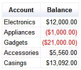
</script>Or this example of Number Formatters, good for accountants and whoever likes numbers:
Which can be generated by this code:
<script type='text/javascript' src='http://www.google.com/jsapi'></script>
<script type='text/javascript'>
google.load('visualization', '1.0', {'packages': ['table']});
google.setOnLoadCallback(draw);
function draw() {
// Create a datatable with your data.
var dataTable = new google.visualization.DataTable();
dataTable.addColumn('string', 'Account', 'account');
dataTable.addColumn('number', 'Balance', 'balance');
dataTable.addRows(5);
var r = 0;
dataTable.setCell(r, 0, 'Electronics');
dataTable.setCell(r, 1, 12000);
r++;
dataTable.setCell(r, 0, 'Appliances');
dataTable.setCell(r, 1, -1000);
r++;
dataTable.setCell(r, 0, 'Gadgets');
dataTable.setCell(r, 1, -21000);
r++;
dataTable.setCell(r, 0, 'Accessories');
dataTable.setCell(r, 1, 5560);
r++;
dataTable.setCell(r, 0, 'Casings');
dataTable.setCell(r, 1, 13092);
// Create a table visualization.
var container = document.getElementById('table');
table = new google.visualization.Table(container);
// Apply an number formatter to the 2nd column.
var options = {'allowHtml' : true};
var formatter = new google.visualization.TableNumberFormat(
{prefix: '$', negativeColor: 'red', negativeParens: true});
formatter.format(dataTable, 1);
// Draw the table visualization with the applied formatting.
table.draw(dataTable, options);
}
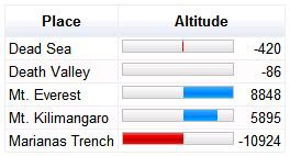
</script>And, lastly, this example of a bar-formatter, which can be used to visually show relative distances from an anchor-point:
Using this code:
  <script type='text/javascript' src='http://www.google.com/jsapi'></script>

  <script type='text/javascript'>
    google.load('visualization', '1.0', {'packages': ['table']});
    google.setOnLoadCallback(draw);
    function draw() {
      // Create a datatable with your data.
      var dataTable = new google.visualization.DataTable();
      dataTable.addColumn('string', 'Place', 'place');
      dataTable.addColumn('number', 'Altitude', 'altitude');
      dataTable.addRows(5);
      var r = 0;
      dataTable.setCell(r, 0, 'Dead Sea');
      dataTable.setCell(r, 1, -420);
      r++;
      dataTable.setCell(r, 0, 'Death Valley');
      dataTable.setCell(r, 1, -86);
      r++;
      dataTable.setCell(r, 0, 'Mt. Everest');
      dataTable.setCell(r, 1, 8848);
      r++;
      dataTable.setCell(r, 0, 'Mt. Kilimangaro');
      dataTable.setCell(r, 1, 5895);
      r++;
      dataTable.setCell(r, 0, 'Marianas Trench');
      dataTable.setCell(r, 1, -10924);
      // Create a table visualization.
      var container = document.getElementById('table');
      table = new google.visualization.Table(container);
      // Apply an arrow formatter to the 2nd column.
      var options = {'allowHtml' : true};
      var formatter = new google.visualization.TableBarFormat(
           {base: 0, showValue: true, min: 12000, max: 12000});
      formatter.format(dataTable, 1);
      // Draw the table visualization with the applied formatting.
      table.draw(dataTable, options);
    }
  </script>
For the complete list of currently available formatters, see our Table documentation with included examples. We're working on more formatters, which we will announce on our discussion group when we make them available.
For more info on using and creating visualizations, visit our documentation pages.
Uhm, "a picture" and "thousand words" and all that...
ReplyDeleteHi Oskar,
ReplyDeleteYes, that was my mistake when I published the original post. I updated it with some screenshots and links to examples now.
Thanks!
One problem with formatters is that if you try to use the Data object they have been applied to with a view, such as a PieChart, the tooltips don't appear correctly (they don't support html, used for the formatting).
ReplyDeleteA workaround is to clone the Data before applying the formatter. But this wastes memory.
It would have been nice if the formatter were not part of the Data, but were part of the view; in this case that would be part of the PieChart options or DataTable. Then you could control the view of the data, without affecting the underlying data itself.