
A good chart can take an elusive concept and clarify it in a visually appealing manner. This ingenious XKCD strip uses a pie chart, a bar chart and a recursive scatter plot, to demonstrate the concept of self description.
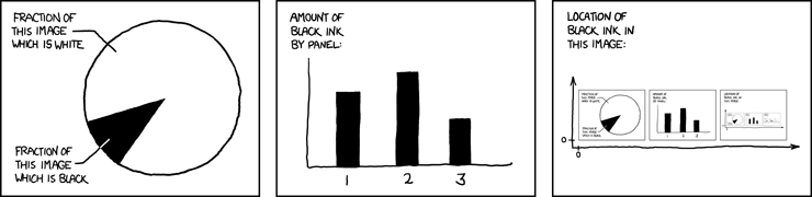


We hope to meet you in person at Google I/O this May. In our Google Chart Tools I/O session we plan to present many of our new features including dynamic icons, which helped us plot our version of the recursive XKCD chart below:


Whether you need a simple line chart, an interactive Geo Map or a complex Motion Chart , Google can help you add live charts to your web page using our Chart and Visualization APIs. Both of these APIs are free and simple to use, however they each have distinct advantages:
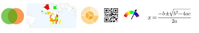
1. The Chart API provides Image Charts which are rendered by a Google chart server in response to a simple URL request. Image Charts are fast to render and can be easily emailed and printed. In addition to the extensive gallery of charts, this server now also provides dynamic icons, QR codes, and math formulas.
1. The Chart API provides Image Charts which are rendered by a Google chart server in response to a simple URL request. Image Charts are fast to render and can be easily emailed and printed. In addition to the extensive gallery of charts, this server now also provides dynamic icons, QR codes, and math formulas.
2. The Visualization API provides Interactive charts which are rendered on the browser using a Google developed JavaScript library. Interactive charts trigger events, providing tool-tips and animations. In addition to a rich gallery of charts, this tool can also read live data from a variety of data sources such as Oracle PL/SQL or Google spreadsheets.
We have discovered that developers occasionally need some help in navigating between the many options and distinct advantages of Image Charts and Interactive Charts, and therefore decided to bring the two APIs under one new framework which we call the "Google Chart Tools". We've accordingly renamed the APIs to Image Charts API and Interactive Charts API and created a simple side-by-side comparison page which you might find useful in choosing which chart tool is better for you.
Image Chart: Oceans of the world
Interactive Chart: Oceans of the world
We hope to meet you in person at Google I/O this May. In our Google Chart Tools I/O session we plan to present many of our new features including dynamic icons, which helped us plot our version of the recursive XKCD chart below:
By Michael Fink, Google Chart Tools team
this is cool..
ReplyDeleteGlad to see the interactive charts finally being shared with the rest of us, thanks!
ReplyDeleteThanks -- I've started using the charts & Visualization API and I wish I had the comparison page when I started. See you at IO
ReplyDeleteThanks, this makes life a lot easier for anyone wanting to display data.
ReplyDelete(On a side note, it would be even more awesome is if there was a way to stylize the graphics outputs to look like XKCD :) )
This comment has been removed by the author.
ReplyDeletethis is great, I like it, and will probably replace my js chart library with it
ReplyDeletenice
ReplyDeleteYou had to use a 3D bar chart for your XKCD version didn't you...
ReplyDeleteWhat's the easiest way to use these tools NOT via the API? ie. Are there any web services out there that let me generate such charts without having to develop a programme myself that utilises the APIs?
ReplyDeleteThanks.
Sweet eye candy indeed! Google really is a Chocolate Factory :-)
ReplyDeleteCool, but 3d pie charts are the worst charts ever. Stop using them.
ReplyDeletethis will replace pivot in microsoft
ReplyDeleteexcellent!
ReplyDeleteThis comment has been removed by a blog administrator.
ReplyDeleteGoogle, Will you let other companies do something else? You are getting bigger and bigger, And your services is great, but, What if you kicked me out for ABUSING ... is that mean that i lost all my files on your services?
ReplyDeletexkcd ftw
ReplyDeletewww.mydials.com for all your visualization needs!!
ReplyDeleteI've been using this API for quite some time now. Why is getting announced only now?
ReplyDeleteIs it possible to host the google apis on local servers. I know that google hosts them on their site but for enterprises you cannot rely on that.
ReplyDeletegreat!!!!
ReplyDeleteBravo chartserver team! Math teachers everywhere should rejoice.
ReplyDeleteI don't think I am alone in needing a really good solution for writing formulas in HTML, and the new chartserver's TeX support is awesome.
I have posted a formula editor utility here that uses chartserver to help you write out math-laden HTML quickly. It translates formulas between $ signs into chartserver tx images:
http://davidbau.com/formula/
Cool ;)
ReplyDeleteJe viens de m'insscrire à google API je voudrais suivre l'avancement qui me permetra d'avancer dans mes fonstions.
ReplyDeleteMr CAZEAU Ronald
Brilliant. I was wondering why there were two separate, but similar APIs available and feared Google didn't know what the other hand was doing.
ReplyDeleteI'm really looking forward to using this!
- Ben
Just wrote a blog post about the new Google Chart Toools:
ReplyDeletehttp://www.javiertordable.com/blog/2010/02/17/new-google-chart-tools
heya,
ReplyDeleteLooks very awesome.
I'm curious, with some of those interactive charts, you can get a tooltip if you click on a point, but is it possible to get a tooltip with a hover? Didn't see it in the API - is it something that you think would be added?
Also, once you click on a tooltip, the only way to close the box is to click on the "X", you can't click outside it. It's a fairly small target, I'm sure it's a bit funny from a usability perspective.
Cheers,
Victor
hey Annotated Time Line is not correct. it is before one month.
ReplyDeletesend 2005,1,1
from annotated time line 2005-2-1
http://code.google.com/apis/visualization/documentation/gallery/annotatedtimeline.html