Let’s check out what’s new:
New canvas page
Options are more descriptive and appear at the top of the page. They open up as dialogs so users can configure or access the app information without leaving the canvas page.

New apps directory page
The apps directory is easier to navigate. We removed the descriptions and arranged the apps in two columns, and you can search for apps within categories, so it all looks much cleaner. We also created a section called "my applications" from where users can open or remove their apps.
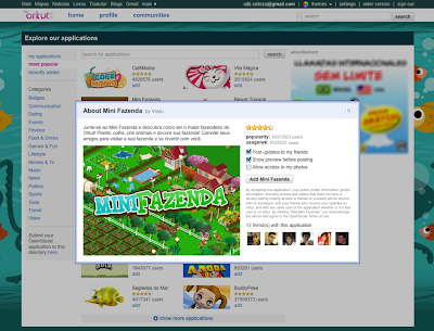
When a user clicks on an app listed in the directory, the screenshot as well as the app’s description and popularity will now pop up in a new window. This window replaces the old app page and allows users to quickly add apps without loading another page.

New profile view for apps
We’re changing the way apps are displayed on a user’s profile. Showing several apps in tabs on the profile page was confusing. We made things simpler having users select a single app to appear on their profile page and other apps (as well as the "about me" section) are accessible by a drop-down menu.
A new apps box
We’re adding a “my applications” box, just below the “my communities” one on the right. This box will list the thumbnails of all apps the user has installed. We hope this will drive more traffic to the app’s canvas page.
We hope you’ll like these changes. Please share your feedback with us at the forum.

Meus Amigos sumiram Vizinhos da fazenda mini PoDE verificar e solucionar Esse Problema ?
ReplyDeleteGrata
Sempre são bem vindas as mudanças do Google.
ReplyDeletegrande google :)
ReplyDeleteSandbox não está logando desde ontem, qnd foi feito o anúncio. Bizarro.
ReplyDeleteaguante minifazenda! yo lo cree
ReplyDeleteHi,
ReplyDeleteI have just launched my site and have been wondering what all this SEO business is all about. Yeah, I know, SEO has been around for quite a while now but I am somewhat of a newbie. All I'm wondering is does SEO really work? I mean, if I were to contract a top seo company to do my SEO for me, is it guaranteed that traffic to my site will automatically increase?
Someone told me about bergstrom-seo.com who happen to be one such top seo company (according to that person) and how they develop seo campaigns that work. Has anyone heard of them or even worked with them? I would like to get a bit more info on this seo business and this bergstrom-seo.com company before throwing my money to the fishes. Thanks
New Orkut layout and design is very poor. I think Orkut is a leader of social networking then also try to copy facebook. I don't know why?
ReplyDeleteThe new layout is not working properly with Win 7 and IE. When i try to load new layout sometime it gives me very funny layout with only my profile photo and nothing else just one, two links and that also not working no logout link also. Then i have to clean my browser history and then reload Orkut to login again then i have to use older version.
I don't like this update from friends method. If developer likes i like to give one idea that is please add storing file and putting artical facility.
I like to put some blog type text about some topic and i like to put some files about that topic so friends can read that text and can download files.
Thank you.
i do agree with Ajay, Orkut lost their competitiveness and particular features. Now even Orkut, which I did love most, follows facebook. What a pity!
ReplyDelete